top of page
Plots / Tables
These are some plots and tables I have created for my side projects and previous internships:
Raw data
Line Chart (Interactive)
To display the Planning Year Needs growth of each Ontario Infrastructure Agency, I have created a line chart by transforming the data into time series. Users can apply filters by clicking each agency down below.
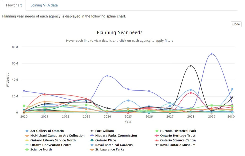
Line Graph
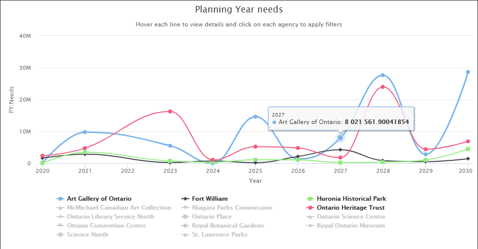
Applied Filter
Line Graph
1/2
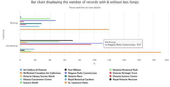
Grouped Bar Chart (Interactive)
Grouped bar chart studying the number of missing entries of each Ontario Agency. Users can apply filters by clicking each agency down below.
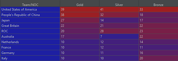
Stacked Bar Chart
Stacked bar chart displaying the number of Olympics Medals obtained by the top-10 countries in the 2021 Tokyo Olympics.


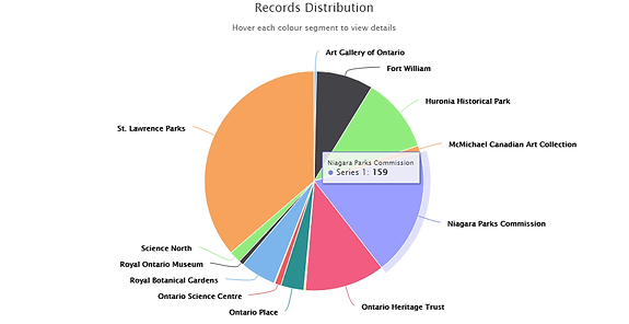
Pit Chart (Interactive)
Pie chart displaying the distribution of records among 14 Ontario Infrastructure agencies. Users can hover each circle portion to get the exact number of records.
bottom of page